The exhibition that will change Christchurch forever


“Rise” at the Canterbury Museum (and beyond with the “Big Walls” component of the show) will be Christchurch's most influential art exhibition since an alternative exhibition to the Canterbury Society of Arts annual show was put on by “The Group” in 1927.

This single exhibition will inspire a transformation of the visual culture of Christchurch in the years to come. The excitement surrounding "Rise" is not just the sheer joy of seeing for real superb artworks from the art movement that will define our generation but also the way that the creative sails of the new Christchurch are being filled with an inspirational gale.

The Canterbury Museum director Anthony Wright should be knighted for taking the bold step of hosting “Rise”.  Nurturing our community through a strengthening of our culture in a time of need - it's a landmark step in the evolution of the role of the modern museum.  

With the art gallery out of commission and large spaces hard to find hosting "Rise" at Canterbury Museum shows a brave and open minded attitude about the museum’s role in the Christchurch of today.  “Rise” is going to be such a momentous event because it is about the people who are going to see it as much as being about the artists whose work is on show.  Street art is the punk rock of art, the movement that inspires a generation of people to take up an art form because through the lens of something new they catch a glimpse of their own inner artist.  Street art is accessible, inclusive - and as will be shown in Christchurch post "Rise", transformative.

The Oi YOU team have clearly built a professional businesslike organisational structure to put on a blockbuster like “Rise” (7500 visitors in the first few days). With a history of two successful shows in organisers George Shaw and Shannon Webster’s hometown of Nelson, then taking their collection to Sydney and Adelaide the unique catalyst aspect of the event has grown using an exhibition of their superb personal collection of street art as the occasion for local and international street artists to complete works commissioned specially for the show.

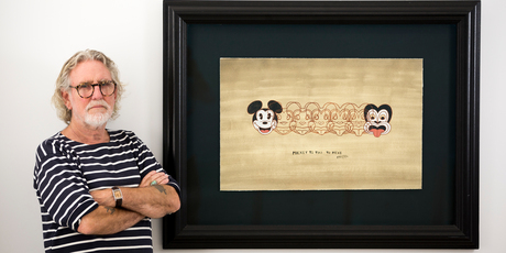
Essentially it's the attitude of street art that is just so universally appealing. It was the spilling over of the exhibition into the main museum that tickled me, whimsical wordplay, sly commentary and placing of objects springing from an intelligent cultural awareness.  The mysterious Milton Springsteen’s paintings were fine examples of how you can subvert and transform most effectively if you first take the time to gain a deep appreciation and understanding of your source material.

To see prints by NZ artists such as Component’s fishing boy “Life is a Lottery” looking perfectly at ease next to Banksy is as thrilling for a New Zealander as having Lorde at the top of the global charts. 

Street art will save Christchurch from blandness in a rebuild driven by engineers rather than imagineers.  Sofles piece behind where our gallery and warehouses were on Hereford St is particularly poignant for us, it’s that mix of skill, imagination and connectedness that makes art meaningful over the long term, we talk of finding a print that “resonates” with a customer, it’s so much more useful and deeper than finding what someone simply “likes”.

This is the only exhibition I am insisting my non arty friends go to see.  I want every teacher to arrange a class trip (Rise runs until 23 March 2014 so there is plenty of time in the new school year). Every Christchurch person who doesn’t think they like art should go too - as street art is the perfect gateway drug that can turn people on to how much fun and enjoyment there is in the world of art.   As Banksy himself has shown if you can reach the market of people who don’t buy prints this is many times larger than the market of people who regularly do, likewise “Rise” is the way to engage with people put off by the thicket of theory that envelopes contemporary art. 

The only negative is that annoying feeling of the world discovering your favourite band!  Street art is the most exciting thing in the art world right now and to have “Rise” transforming your hometown in a globally significant way is only just a little bit short of unbelievable.   Street art is the art movement of now and because of the unique situation of Christchurch post earthquake “Rise” will be a pivotal show when art history grads of 2114 are researching the impact of this exciting art movement across the world.

2013 - NZ Art Print Market Review

During the gift buying season that marks the end of another year all publishing and cataloguing of new prints screeches to a halt while we focus on simply getting the artworks out the door and delivered in time for Christmas.  So just before we descend into the busiest time of the year our catalogue manager takes a look back at 2013.  In this post Antony Ellis reviews the NZ art print market in 2013 from a trends and sales perspective to highlight the significant milestones of the year from our position as NZ’s largest art print retailer.

Art Print Trends during 2013

The best selling print for 2013 in NZ will either be Frizzell's  Mickey to Tiki (yet again) or the wonderful new “Native Birds of NZ” Poster based on the illustrations of J G Keulemans (the artist who illustrated Buller’s Birds of NZ).  The most popular categories of prints overall were Kiwiana and vintage posters but the street art collection is showing the steepest rise in traffic (it was a big year for Banksy with his unofficial New York residency - we also have finally secured a reliable supplier of Banksy prints direct from the UK so had a lot more street art prints to choose from by the end of the year).  The Native birds poster also boosted the popularity of native NZ birds as a theme (it’s a toss up between tikis and birds as the favourite subject of 2013), alongside perennial favourites, the NZ landscape and Coastal & Sea Views.

We have noticed one surprising drop in sales - that of prints on canvas.  Even though we include the value of both unstretched and stretched (mounted) canvases in this sales category (framing of prints on paper we measure as separate line item) sales of prints on canvas are down by nearly twenty percent on 2012.  It’s definitely not the end of the canvas trend full stop but it does point to canvas prints being part of the wall art mix rather than a replacement for reproductions on paper that some people in the industry were predicting.  Picture framers will be relieved if the trend for frameless (gallery wrap) canvas prints starts to abate.  At the lower end of the market (in art industry parlance, non “brand name” artists) the unexpected competition with hand painted canvas prints at rock bottom prices from China being may have hastened the end of generic designs on canvas that were stocked in vast numbers at new outlets for prints such as furniture shops and the bubble like profusion of “design” and “gift” stores that popped up throughout NZ over the last decade.

Publishing News: Prints, posters & limited editions new in 2013


New prints during the year started with us rounding out the range of reproductions of paintings from “gallery” or “fine art” artists not from NZ.  The strength of the NZ dollar against the US dollar and the Euro has made purchasing from overseas art publishers a much more pleasant experience.  We listed many more large art posters (usually the standard US 3 foot by 2 foot size) at prices between $NZ24.95 - $NZ29.95, by famous artists like Klimt, Monet, Mucha, Dali and Kandinsky as well as a good selection of new prints in various formats (such as the Whaam! diptych from pop artist Roy Lichtenstein).  After a few years building up our range of indigenous NZ vintage posters we also filled out the vintage range with new titles focussed around our food and drink category (NZ designers of the vintage period did concentrate on travel and tourism, if you want vintage wine and beer advertisements these tend to be French or Italian).  The top selling print by a non-NZ artist is still the “Holiday on Wheels” print by Boulanger but easily the most popular artist by total sales was street artist Banksy.

Also added were new reproduction prints by significant NZ artists like C F Goldie, Michael Illingworth, Colin McCahon and Bill Hammond.  Our photography selection extended with a large series of large format panoramic posters by photographer Richard Hume.  The biggest collective launch of NZ prints came right at the end of the year with the series of reasonably priced Dick Frizzell reproductions of some of his most well-known silkscreen prints and paintings, images such as Popduck, Grocer with Moko and Big Kiss.

NZ original printmakers like Michael Smither, Tony Ogle were busy during 2013 and limited edition prints from contemporary artists (and now also increasingly from designers/illustrators) such as Greg Straight, Jane Puckey, Susan Haywood Smith and Alec Tayler were listed for the first time.

New NZ Fine Prints Catalogue


The launch of our 2014 catalogue of “Fine Art Prints, Posters & Limited Editions” was a huge effort behind the scenes. Due to the earthquake disruption we skipped an update in 2011.  We must have been a bit rusty as there were more than the usual array of problems (colour matching, making the captions fit underneath every image and checking for typos) publishing this year’s catalogue (the entire first printing was recycled after the complete run was printed without the proof being signed off) so it was relief to see the pallet of brand new catalogues arrive at our warehouse even if they were six weeks late.  The way the auction houses manage to produce their beautiful catalogues of paintings every few weeks throughout the year (especially the dizzy array of designs from Art & Object) is astonishing to contemplate.

NZ Art Print Market Predictions for 2014


  1. We will see prints becoming a little less pop and a bit more street.  
  2. NZ vintage will no longer be seen as hot "trend" (the increase in supply of titles was responsible for the rise in profile of this category more than it simply being in fashion) but will become an enduring part of the market like it is in other countries. 
  3. There will be more “modern vintage”, contemporary prints in a retro style hopefully more representative of modern NZ society than the increasingly simplistic “Kiwiana” style images that are too often simply watered down copies of more and more obscure nostalgic objects from our collective past. 
  4. Dick Frizzell will continue to be the top selling NZ artist by overall print sales and by value, with a new and enthusiastic publisher by his side planning to print dozens of new prints alongside new silkscreen editions we’d be foolish to call the end of his reign as NZ’s most commercially successful artist and printmaker. 
  5. Due to overwhelming demand we’ll be selling more prints pre-framed in our standard timeless framing styles as we slowly roll this out across all of Prints.co.nz but we still support the role of the custom picture framer as being a vital partnership in the enduring story of a business such as NZ Fine Prints.

Gifts for Christmas 2013 - Mailing Dates

As always pre-Christmas is an especially busy time for us here at NZ Fine Prints, art prints are perennially popular Xmas gifts and making sure we deliver on time for Xmas is vitally important. Please call us on 0800 800 278 if you have any questions about delivery of your prints in the lead up to Xmas.

NZ Fine Prints Christmas Mailing Dates for 2013 are as follows:

Delivery worldwide at our standard rate of just $NZ15 (for any number of prints).

UK & Europe, East Asia and North America

Please order your gifts by Wednesday 4 December 2013


Australia & South Pacific

Please place your order by 9 December 2013

Rest of World

Order prints by 2 December 2013

Xmas Delivery to NZ Addresses

Standard Delivery for $NZ6 (for any number of prints)

We need to have your orders for prints being delivered as gifts for Xmas by 3pm Friday 20th December

Deadline for next day courier delivery via CourierPost with guaranteed delivery for Xmas day is 3pm Monday 23 December

Framed Prints - please order 10 working days before these mailing dates to ensure we can deliver by Christmas.

Gift Vouchers


NZ Prints also deliver gift vouchers by mail to NZ addresses if ordered by 23 December - and email gift vouchers are even being purchased on Xmas day itself and delivered instantly around the world. Now that is last minute Christmas shopping!

Shipping & Delivery Updates


As we get closer to Xmas we will update any delays or known issues with Xmas delivery on our shipping & delivery page.

Slow Death of Kiwiana?

In this article we talk to NZ designer Shann Whitaker of Tantrum Design who has recently declared he thinks the popularity of Kiwiana is just another trend, and a perhaps a fad that is on the verge of dying.  

Whitaker argues that Kiwiana has not just been a relabelling of what is unique to or easily identified as being from New Zealand as "Kiwiana" but a trend that has perhaps done its day. It's an interesting contribution to the debate around whether kiwiana is just another trend that has now possibly been done to death or have we just taken to calling cultural products from NZ that were always there and will always be for sale (tikis for example) with the previously kitschy term Kiwiana?

NZ Designer Shann Whitaker
Kiwiana "Bloated and Swollen", needs "A Cleanout"

Whitaker says "Like every good idea and trend, the good times must come to an end."  Although Kiwiana hasn't yet actually died "It has just become rather bloated and swollen, to a point that every shop, chemist, two dollar store or fair stall has something Kiwiana in it."

Whitaker says that the most important factor in the decline of Kiwiana is time, "it has probably been a good decade since the scene really took off". He adds "Sure, you can still find great creative NZ themed gifts but lets face it, New Zealand has a limited amount of iconic imagery, flora and fauna. There are only so many different ways you can dress up a Fantail before you start going a little crazy. I used to joke that we needed to find some kind of new bird or mammal just so we had something new to design. These same icons have been designed to death now and the regurgitating of the same material is becoming stale."

According to Whitaker Kiwiana needs a "clean out".   He says the "sheer number of creatives trying to design in a small market has become over populated. Copycats, the faux designers ripping off new ideas and selling them at low low prices to cheap stores do not help the market."

Kiwi design is more important than kiwi made to Whitaker

Although he is talking about giftware and design store products more than kiwiana art specifically Whitaker makes an interesting distinction between kiwi made and kiwi designed but manufactured overseas and calls for the buying public to "embrace creatives for their ideas not just their manufacturing abilities."

"I was 100% NZ Made for six years", he says, "but as my ideas changed and I got more adventurous with my products I realised that I was restricted by price. I feel that as New Zealanders our strengths are in our ideas and creativeness. We cannot compete with the low wages and long hours that make China and India  powerhouses of the manufacturing world."

In NZ Fine Prints part of the broader market for cultural products from New Zealand we still believe that the rebranding of the work of NZ artists as kiwiana art is mostly a blurring of the definition of "fine art" from New Zealand and popular or commercial art in the public's perception.  However Shann's assertion that the days of derivative - or less charitably copycat - "kiwiana" style designs being sold everywhere on everything is coming to an end (even if the name still sticks to art that has nothing in common with buzzy bees and four square man beyond being created in the same country) does seem to be common sense too.  What we would be concerned about would be if Kiwiana was both a trend and a blurring of definitions that had the result of quality work by NZ's best artists being dismissed in the near future as merely Kiwiana that is no longer fashionable due to the factors Shann has identified.

Is kiwiana just a trend? If so is "Kiwiana" a trend that is dying? Please leave a comment below.

Brilliant NZ Native Birds Poster published by Te Papa Press

"Native Birds of New Zealand" Poster | Image Credit: Te Papa Press
When Geoff Norman, author of "Buller's Birds of New Zealand: The Complete Works of JG Keulemans", spotted a framed poster of "Native Birds of New Zealand" at his friend Jock Phillip's place (Jock's a well known NZ historian and editor of "Te Ara: The Encyclopedia of New Zealand") he realised this could be the poster that Te Papa Press were looking for to accompany the publication of his award winning book.

It was the perfect poster to accompany his book's launch because the birds in the poster are based on the artwork of JG Keulemans, illustrator of Walter Buller's "A History of the Birds of New Zealand".

The Book
Norman's book "Buller's Birds of New Zealand: The Complete Work of JG Keulemans" (already on its second printing and currently available from bookstores and Te Papa Store) included the complete set of 95 artworks from both editions of ‘A History of the Birds of New Zealand’ by Walter Buller and the subsequent supplement. In the book each bird painting is accompanied by extracts from Buller’s original, descriptive text. It also includes up-to-date taxonomic information in English and te reo Māori, as well as background information about Keulemans and the production of these books.

Hand-coloured prints by watercolour artist Keulemans were first published in 1873 in the first edition of Walter Buller’s iconic book, known colloquially as ‘Buller’s Birds’. Aside from a limited edition released in 1986, this new book is the first time that the full set of these prints of native New Zealand birds has been printed in colour since the nineteenth century.

Buller completed the second edition in 1888, containing new plates, this time using chromolithography, an early form of colour printing. Author Geoff Norman came across the original watercolour proofs for this edition and the subsequent supplement by chance while in the UK.

“I was staying near Tring where the Ornithological Branch of the Natural History Museum is based, and was told about their New Zealand cabinets and also that the original watercolours for ‘Buller’s Birds’ were kept there. I realised how special those paintings were, and when I saw them knew that I wanted to republish them together with the hand-coloured first edition plates,” says Geoff.  “Keulemans’ paintings of our birdlife are bright and luminous and clear. They’re masterpieces. We’re presenting them in this new book at the same size and in the same order as they appear in the original books, but modern scanning and printing means that we are able to reproduce the colour and detail in the way they artist originally intended. I think Keulemans would like what we’ve done with his work.”

The Poster
Jock Phillips had bought a framed version of the "Native Birds of New Zealand" poster from a second hand shop. His copy of the poster had been reprinted in the 1990s by a Dunedin printer that was no longer in business.  Originally the poster was produced as a chromolithograph (a coloured print using a tablets of stone as the printing plates). The designer/artist was William Schmidt (1870-1969). He was born in Auckland and did lithographs for The New Zealand Graphic. His father was John Diedrich Schmidt, a German who was one of the founders of the Melbourne Age before he moved to New Zealand where he set up a business as a printer and engraver.

The poster was scanned but was not touched up or "Photoshopped".  Te Papa Press added a light grey border around the poster and extend the light grey text panel at the bottom to include source material and Te Papa Press details. There are 25 native bird species depicted in the poster and they are identified with tiny numbers and a key at the bottom of the poster that also gives the fraction of natural size at which the birds are reproduced.

This publication is a glorious re-discovery of an unusually decorative and well designed early NZ poster.  Te Papa Press's printers have done a wonderful job of re-printing this poster, "Native Birds of New Zealand" is printed on a superb silken paper stock that does not merely reproduce the original chromolithograph, it reincarnates it!  Copies of this poster are on sale here at NZ Fine Prints.

Gifts from NZ and International Duties/Taxes

New Zealand has a pretty enlightened regime when it comes to customs duty, there are very few categories of products that are subject to import tariffs (duties).  The threshold for the imposition of GST only kicks in when the value of the goods would have a GST component greater than $NZ60, less than this and the cost of collection is deemed to not be worth the extra revenue to the government.

This may change, according to the customs website "Customs, Inland Revenue, and Treasury are currently looking at whether it is feasible to collect GST from overseas online purchases. A discussion paper outlining a range of issues related to online shopping and options for collecting GST is being developed and will be available for public comment later this year.  The Government does not currently collect GST on lower value goods for practical reasons – the administrative costs would be higher than that GST collected. A 2011 review found it was not cost effective to collect GST on items under $400. But if improvements can be made to the way goods cross the border and GST is collected, then the threshold at which benefits of collection outweigh the costs may decrease."

All very well if you are importing goods into NZ or purchasing gifts for friends and family in New Zealand from overseas this Xmas but using a NZ based supplier.

Problems with duties can arise when people order items either for themselves or as gifts from NZ to be delivered to countries with murkier or more oppressive import regimes.  Nobody wants the gift recipient to be landed with the hassle and expense of paying for the privilege of receiving your gift at Xmas! NZ Post has a very expensive product that can be added on to their already pricey Express International Courier service called Delivery Duties and Taxes Paid (DDTP) that "gives you the option to have duties or taxes incurred for parcels charged back to your New Zealand Post Account – this can reduce delays and ensure you pay rather than the recipient." Useful but prohibitively expensive at this time.

NZ Customs Declaration Form
Nearly all gifts NZ Fine prints send outside of NZ use the green customs declaration form for parcels up to 2kg (each print weighs about a 100gms) and are marked as "gift".  No matter what a customer asks us to declare at checkout time we have to itemise the contents of the package at the correct value. It's the law!

However there are a couple of things we can do to help your parcel get through without attracting duty at the other end.

1. The sheer volume of Xmas mail to countries like the US and UK means that not every parcel is going to attract the attention of customs.   Non-commercial mail is often treated more leniently, so we can hand address the parcel AND use your name and address as the sender rather than "New Zealand Fine Prints" or "Prints.co.nz" if the value of your gift is over the threshold.

2. The other option is a gift voucher - these are sent via email or post and the recipient will be able to receive the full value of your gift without customs being involved.

In practice the rapid growth in online sales coupled with the impossibility of screening every package means that nearly all gifts sent by us are delivered without attracting duty at the other end. Australia has an uncommonly lenient regime which is a huge bonus for New Zealanders sending gifts to the one place that has more kiwis than any other country outside of NZ - if your gift is under $AU 1000 there is zero duty or GST going into Australia.

Historic "Epicene Women" letterpress poster opposing women's suffrage in NZ

This well known poster "Notice to Epicene Women" from Wellington identity Henry Wright is an amusing artefact from the fight for women's right to vote in New Zealand.  NZ was the first country in the world that had universal suffrage with an Electoral Act enfranchising women becoming law on 19th September 1893.

Vintage NZ Letterpress Poster "Notice to Epicene Women"
NZ Anti-suffrage poster "Notice to Epicene Women"*
(You can buy an authentic letterpress re-print here)

The National Library has dated this poster's printing to November 1902 citing an extract from the New Zealand free lance 22 November 1902, page 6: "I wonder who "Henry Wright" is? He has issued a circular to "Epicene Women", who are interested in the elections, asking them not to call on him, but to stay at home and cook their husbands' dinners, and other things. Evidently a woman hater. Oh well, it is delightful to have such frank gentlemen living in Wellington. I am interested in the elections but I shall not call for "Henry Wright's" vote. There appears to be nothing epicene about him".

However an anonymous researcher has added a note to the bottom of the re-issued letterpress poster that the notice was first used to deter campaigners door knocking for a series of massive petitions that had gathered the signatures of nearly a quarter of the adult European female population of New Zealand by 1893.  [The term "electioneering women" would not have referred to women standing for Parliament and door knocking for votes as women were barred from standing for Parliament in NZ until 1919.]

Both the earlier and later usage dates could be correct if Mr Wright (and others - there is no record of how the size of the original print run) continued to provoke people with his poster for some years after the passing of the Electoral Act into law.  But the actual date of first printing is almost certainly around 1893 rather than the National Library's date of 1902, it seems unlikely that even the most hidebound reactionary would still be bearing a grudge of such lasting intensity about women being allowed to vote a decade after the Electoral Act was passed  that they would commission such a poster for its first use as late as the 1902 election.

Henry Wright
So who was Henry Wright? Henry Wright was a Wellington debt collector and business identity, here he is in a cartoon published alongside the following verse in Truth September 26 1914.

A well-known man is Henry Wright.
Though "stoney" [broke] blokes shun him as a blight.
His spats and his hat
Just suit him quite pat
While his dress but reflects
His fondness for "checks"
And its little he recks
That many a woe-worn bankrupt might
solemnly swear he's "The Wrong Mr Wright"

The Evening Post characterised Wright at the time of his death at the age of 92 in 1936 as "one of the city's best-known figures. He has been described as the most benevolent looking professional debt-collector in the world. He was usually dressed in a belltopper, frock coat, and check trousers, with brightly-coloured tie and an opal pin."

This unique piece of NZ reactionary political propaganda has recently been re-printed using the traditional letterpress method (with moveable type laid by hand) by the letterpress enthusiasts at the Ferrymead Print Studio, the home of a superb collection of vintage printing equipment kept in working order entirely by volunteers.  For sale at just $9.95 in NZ Fine Prints' vintage poster collection.

Special thanks to the "Papers Past" digital repository of New Zealand newspaper archives for enabling this writer to research this article on the background of the man behind this old poster.

*The full text of the poster reads:

Notice to Epicene Women

Electioneering Women are requested not to call here

They are recommended to go home, to look after their children, 
cook their husband's dinners, empty the slops, and generally attend
 to the domestic affairs for which Nature designed them.

By taking this advice they will gain the respect of all right-
minded people - an end not to be attained by unsexing themselves
and meddling in the masculine concerns of which they are profoundly ignorant.

Henry Wright 103 Mein Street, Wellington.

Story of a print of New Plymouth that appeared in the British Parliamentary Papers

Gully, John 1819-1888 :New Plymouth, New Zealand. [London] Day & Son [1860].
Ref: B-051-015. Alexander Turnbull Library, Wellington, New Zealand. 
http://natlib.govt.nz/records/22326669
This rare print is the only New Zealand view to appear in a British Parliamentary paper in the period up to 1875 (the period covered by Ellis "Early Prints of New Zealand").  It was re-printed by Avon Fine Prints in the 1960s and the original watercolour that the print is based on by painter John Gully is in the National Archives.

The print accompanied a despatch from Governor Gore Browne dated 13 March 1860 and appears in Command paper 2798, 1861: "Papers relating to the recent disturbance in New Zealand."

The description of New Plymouth which accompanies the view is not particularly complimentary about the new settlement.

"The town consists of a struggling village on a skirt of flat land, which is enclosed and commanded by a higher table land encircling the town in the form of a crescent. One end of this crescent is Marsland  Hill, on which the barrack stands, and on the other extreme we are about to erect a stockade. The intervening space between the barrack and this block-house is about three quarters of a mile, but the ground is broken by ravines and swamps and covered with fern, so that what is delineated in the New Zealand Company's plan as squares and streets is in reality wild land, much tormented, and well adapted to cover and conceal the approach of an enemy. Isolated cottages dotted about at intervals, the town being confined to little more than a single street on the shore.

The inland country generally is covered with high fern and dense forest, some of which is almost impenetrable to Europeans, and is everywhere broken by ravines and streams which are thrown off Mount Egmont [Taranaki]. There is a native pah in New Plymouth . . . and there are numerous pahs in every direction . . . 

The proposed blockhouses, which look so imposing in the sketch, may be described as wooden guard-houses, large enough to contain twenty men each. They are not yet constructed."

The view was redrawn for Sir James Alexander's Incidents of the Maori War, 1863

Mr John Gully
The Nelson Provincial Museum, Davis Collection: 1138
John Gully was a major New Zealand artist - according to Una Platts "Nineteenth Century NZ Artists" probably the most popular of his time.  Gully was born in Bath, England. He was apprenticed to an iron foundry and graduated next to the designing and drafting department. However this did not satisfy the young Gully's ambition and he spent periods as clerk in a savings bank and worked in his father's business. Gully took private lessons in painting during this time. In 1852 he and his wife and children emigrated on the John Phillips to New Plymouth.

In 1858 "J.G. of Omata" was advertising ready to paint "views" of properties for sending overseas. He farmed at Omata and worked as a clerk in New Plymouth. Gully took part as a volunteer in the Taranaki wars but was invalided out of the Army. In 1860 Gully and his family moved to Nelson where he settled permanently.  Gully was Drawing Master at Nelson College, then draughtsman in the Lands & Survey Office.

In 1863 two of his paintings, one a wreck of the Lord Worsley, one a view of Mount Egmont were advertised for sale. The encouragement given him by von Haast, whose "outlines" of mountains he coloured, and by the painter J. C. Richmond, then Commissioner of Crown Lands, was probably the turning point of his career. Richmond went on painting expeditions with him and used all his influence to make Gully's work known. In 1865 Richmond enlisted the help of his brother, C. W. Richmond, then a judge in Dunedin, to get his own and Gully's work to the NZ Exhibition and to see that people knew that Gully was ready to paint professionally.

By 1870 Gully was probably the most popular painter in the New Zealand. He exhibited watercolours at the Intercolonial Ex Melbourne 1866-67. In 1878 retired from the Lands & Survey Office and began to spend his full time painting and was listed as a Nelson artist in Wise's directory.  John Gully nearly always in watercolour and was greatly praised for his ''atmospheric effects". In the NZ and South Seas Ex Dunedin 1889-90, a group of watercolours by the "late Mr Gully" were shown as a special exhibit. Exhibited: Fine Arts Association Wellington 1883, NZ Academy of Fine Arts 1889, Melbourne International Ex 1880-81, Centennial Ex, Melbourne 1888-89.  Paintings included in Centennial Exhibition in Wellington1940. Represented extensively in Nelson's Bishop Suter art gallery, and Gully's paintings are in most gallery and library collections throughout NZ today.

Mickey to Tiki now available in two new sizes

Dick Frizzell with Mickey to Tiki
(Image via NZ Herald Photo: Greg Bowker)
With the closure of the Christchurch Art Gallery shop for at least two years the art gallery has given the exclusive right to reproduce several prints from their collection to Christchurch publisher Image Vault for the next three years.

This includes the right to reproduce NZ's top selling print of the last few years, Dick Frizzell's "Mickey to Tiki Tu Meke" (the story behind how this print originally came to be in the collection of Christchurch Art Gallery is here).  Because of this new arrangement we are now able to offer Mickey to Tiki in two new smaller sizes at lower price points (265 x 400mm at $49.50 and 365 x 550mm at $77.50).  Prints in the original size (735 x 480mm) are still available but we are not sure for how long at this stage.


Vintage "Fun Map of NZ" Re-printed

Fun Map of NZ (1950s vintage)
Today we listed for sale a reprint of an unusual vintage NZ map, the "Fun Map of New Zealand: Wonderland of the Pacific".  A New Zealand Government Tourism Department publication originally printed in the 1950s. Possibly designed by Stopford G. Wrathall, the map is credited to the Charles Haines(?) Advertising Agency Ltd, Wellington on the reverse.  When researching the provenance of this new image we found a picture of what we think was printed on the reverse of the map when it was first issued [NB: this is not reproduced on the reverse of the reprint for sale from today here at NZ Fine Prints], we have just reprinted the actual map.

It has taken some deciphering but here is a transcript of the text on the map's reverse side. Presumably the map was folded into a pamphlet sized handout to be given to tourists visiting NZ. Some spellings are Americanised, perhaps this was publicity destined for tourists from the North American market.

Fun Map of New Zealand

Life without humour would be a very dull business indeed. Some lucky people such as the late Mark Twain, Crosbie Garstin and others, found humour everywhere, and left a rich legacy behind them for the world's enjoyment.

There is therefore no need to offer apologies for the appearance of the "Fun Map of New Zealand", which, while making humourous reference to many historic and notable incidents in the Dominion's history, does so without malice and in a spirit of genuine light-heartedness.

Original text on reverse of the Fun Map
From the delightful representation of the "Three Kings" in the far north, all looking slightly "blue" as though feeling "just a little bit out of it", to the busy oyster-scoopers of Foveaux Strait, there is one big smile for owners of the "Fun Map".

New Zealanders should gain added enjoyment from visiting familiar places made more attractive still in the guise of humourous representation, while visitors from abroad will be enabled to invest the various localities and points of interest referred to, with an extra bright and cheerful atmosphere.

With the added attraction of humour, the wide variety of outstanding scenic and holiday resorts for which the Dominion is world famous,  will be brought more directly into focus, and the world at large will be the better able to realize [sic] that New Zealand's claim to being the "Scenic Playground of the Pacific" is indeed based on solid foundations.

A world in miniature Different, Varied, Unique

New Zealand is indeed a veritable world in miniature, for every imaginable natural wonder and scenic attraction appears to have been reproduced within the length and breadth of the Dominion. Towering mountain peaks, great glaciers, luxuriant sub-tropic forests, weird thermal regions, huge volcanic cones, magic caves, beautiful lakes and rivers, and majestic fiords, may all be found here in close proximity and in striking contrast to each other. In no case more than a day's journey from the main centres necessary to reach any of these resorts.

Free Travel Service

Tours Planned… Tickets and Booking for Transport and Accommodation
One of the principal duties of the New Zealand Government Tourism Depart is to afford all possible assistance to travellers. With a thorough knowledge of the conditions, the Service will, free of charge, plan itineraries, suitable to the needs and desires of the individual or party, make reservations for trains, steamers, motors, air travel and hotel accommodation. Officers of the Department meet in the stream all incoming passenger vessels.  The Department's officers, honourary representatives, and agencies overseas are available to support the work of the organization [sic] in the Dominion. 

A Playground of Unique Variety

New Zealand can offer a greater variety of attraction for the sporting enthusiast than any other portion of the globe. Shooting, fishing, mountain sports of all kinds, racing, golf, tennis, bowls, form but a few of the many healthful recreations which can be enjoyed in the Dominion practically all the year round.

Bountiful sunshine without the extremes of heat or cold makes the pursuit of sport a matter of keenest enjoyment and this is further enhanced by the provision of thoroughly up-to-date accommodation at all the leading health and holiday resorts established throughout the country. Full particulars and details covering every phase of activity including bookings, reservations, etc may be obtained from the New Zealand Government Tourism Department's Bureaux and Agency Offices throughout the world.  

We have the "Fun Map of New Zealand" for sale in both the map and vintage poster collections in our online gallery.  The re-print (NZ$69.95) is on photographic paper, it has been printed on a high quality inkjet printer using lightfast inks.

KUPU - Word prints by Weston Frizzell

Kupu Print by Weston Frizzell
"Kupu" Maori noun. Definition/translation into English "Word".

In 2009 Weston Frizzell began exploring and remixing the iconography of NZ fine art and popular culture into the letter series, a suite of prints that rearranged letters appropriated from iconic NZ artworks by artists such as Colin McCahon and brands, for example Watties and L&P.  The first word prints produced were those perceived by the artists as the most prominent in the kiwiana genre of decorative art, Aotearoa, Aroha and Home.

For the second series of word prints the initial intention was to create artworks montaging images of the letter paintings to form a series of words specific to the location of each destination of a touring show.  Taupo was the first of this series (in an edition of 10 that has now sold out).  The release of today's suite is arranged around a choice of letters specifically restricted to those of the written Maori language again with visual subject matter limited to NZ only. The prints are "Kupu", "Mate", "Pakeha", "Kapow" and "AEIOU".

Working backwards from the answer, Weston Frizzell conceived print designs that combine letters from a painted series. The individual letters are realised as 800 x 1200mm painted artworks, then images of the completed paintings were digitally captured, and the files assembled to create the final digital master files. Weston Frizzell regard the final work as not derivative of the painting process. The inverse is true. The paintings are regarded as artifacts of the creation of a digital print!
Otis Frizzell and Mike Weston signing the new prints
at their Auckland studio
Who is Weston Frizzell? We have written before about differentiating your Frizzells, but in essence Weston Frizzell is the collaborative identity of artists Otis Frizzell and Mike Weston. An experiment in the subversion of brand management theory that has evolved into a successful and frequently controversial art identity (see for example the controversy over their Auckland Supercity logo or Weston Frizzell ask "Who are the real terrorists?"), Weston Frizzell occupy a cleverly conceived niche that is now well established on the NZ fine art stage.  

All of the Kupu work can be seen at the touring exhibtion of Weston Frizzell prints and paintings produced by Th'ink and The Area, check the show out in Wellington at Thistle Hall, 293 Cuba St 29 July - 4 August 2013 and at the International Visual Methods Conference at Victoria University 2 September to 6 September.  Kupu moves to Auckland at Augusto, 90 Wellesley St 20 August to 25 August and then onto Melbourne at Second Story, 159 Sackville St, Collingwood 23 September to October 6th.

NZ Fine Prints sells gallery's land to the Crown

New Zealand Fine Prints and associated companies (such as Capper Press and Avon Fine Prints) moved into the old Royal Exchange Assurance building at 202 Hereford St in the Christchurch CBD from cramped quarters above the National Party offices in Tuam St. It was the end of the 1960s and staff numbers were growing with projects like "Captain Cook's Artists in the Pacific" in full swing.  For nearly fifty years the 1890's era warehouses at the rear of the site was packed full of books and prints and the 1920s two storied building facing Hereford St comprised gallery and office space.

After September 4 2010 we spent well into six figures on temporary repairs and because of this early warning we were extremely fortunate that no-one was injured or killed although February 22nd 2011's earthquake damaged both buildings beyond repair.

Because such a large proportion of our business is now online (New Zealand Fine Prints is behind NZ's largest art print and poster site - prints.co.nz) the physical destruction of our buildings was, we thought, a temporary setback - an opportunity even to rethink the design of our buildings to relate better to other businesses on our block with a more pedestrian friendly access from Cashel St, Liverpool St and Woolsack Lane.   Our plan had always been to redevelop the site over time, preserving the character of the buildings in a central city location with plenty of parking with our unique business offering the largest range of prints in NZ as the anchor tenant.  We were not property developers, ours was a staged development intended to keep 202 Hereford maintained and economically viable for the next generation above all else.

When the Crown announced that our land was going to be seized for the so called green frame our initial reaction was disbelief.  But today we are announcing that along with many other CBD property owners we have been steamrolled by the Crown into accepting their offer for our land.  For an owner occupier with a sentimental attachment to our family's land we would never have sold our land at the low price offered by the Crown in the open market.  The idea that we are a willing seller is ridiculous as with only a single buyer and the threat of compulsory acquisition hanging over us we simply had no choice but to accept.
The ghostly outline of NZ Fine Prints' old gallery after demolition

Our main shopfront may be online but central to the DNA of our business is our love of NZ's visual culture and history, a sense of connectedness that is rooted in a specific geographic location.  The internet is ephemeral, a stock room piled high with packs of art prints on hundreds of shelves is tangible, even if a customer had never visited us they knew that behind the online gallery lay a family run business that had been around for a long time in one place.

Freed from a physical location (we may have been 2 1/2 years in Cashmere but it still feels transitional) we have renewed our focus on growing the online side of the business but despite the exponential growth that a website offers in terms of extra sales for our artists we are very sad that we are not being allowed to rebuild on our completely undamaged land (our place is being taken by a lawn).

It is businesses like NZ Fine Prints that make a central city different.  Taking our land away from us and imposing a top down plan on the rebuild of the CBD removes the entrepreneurial skills that the businesses around us had to make our block work with the hand the earthquakes dealt us.  NZ Fine Prints were also committed to the rebuild (trapped even) and prepared to invest more than a developer would based purely on the numbers as we had a sentimental attachment to making this patch of Christchurch awesome for our kids even if we didn't make much back financially for twenty years.

New location - look out for JK's kiwi sign
on Hackthorne Rd just past the school.
While we assess the options for a future site of a gallery, stockroom and warehousing we have made the decision to stay in our temporary premises (we are working from the basement of a classic Cashmere character house opening out into a superb garden with views across Christchurch, it's pretty nice here if a little quiet compared to the CBD) for at least another year while we wait and see what happens with the rebuild.

Customers looking for prints who are in Christchurch are always welcome to visit us, we now have nearly all prints back on one site thanks to some pretty innovative shelving (our prints are now double and triple bunked instead of luxuriating on a shelf of their own) although we are not carrying quite so many framed prints in stock framing to order within a few days instead.

The fact that the Crown will be packaging up our land for re-sale in the future without possibility of us buying it back at the same price seems really unfair and why businesses got such a harsh deal compared to property owners in residential neighbourhoods where the land was damaged (full payout of GV plus demolition costs) are the two things that we continue to feel bitter about. However we have decided to just give up and move on, lets hope the bureaucrats from Wellington flying down here each week know what they are doing with Christchurch.

Next Art Prints, Posters & Limited Editions Catalogue - Sneak Peek

We have completed the difficult but enjoyable task of selecting and cataloging just over 500 fine art prints, posters and limited editions for the next New Zealand Fine Prints free mail order catalogue.

Here is a sneak peek at our 2014 catalogue in PDF form (although we have compressed it to 8MB it will take a few seconds to download).

Click here to download Catalogue (PDF)

Printed free versions of this catalogue will be available from early July. Please let us know if you spot any errors before we send this final draft off to the printers!

Saluting a NZ art publishing success as Grahame Sydney quits prints

Nighthouse II by Grahame Sydney
New Zealand's most successful art publishing collaboration of the past two decades is coming to an end.  We have been told by Christchurch publisher Image Vault that immensely popular contemporary NZ landscape painter Grahame Sydney is withdrawing copyright permission to reproduce his paintings digitally (so called giclee printing) and we understand that other editions previously available as off-set only will not be re-printed once these sell out.  This affects several popular titles immediately that are printed digitally - including Nighthouse II, Evening at Ben Ohau and Albatross at Deborah Bay which will no longer be available once our stock on the shelf is sold - and the other titles will progressively be discontinued by NZ Fine Prints as the publisher deletes them.

This marks the beginning of the end of one of the most successful publishing relationships in our industry's history as for several of these past few years Grahame Sydney was the top selling NZ artist for New Zealand's galleries, picture framers and other retailers selling prints.

Grahame initially self-published prints in the late 1970s - reproducing his paintings Rozzie at Pisa,
Evening at Ben Ohau by Grahame Sydney
Dog Trials Room, Auripo Rd and Wilson's Boys Boat [when you see an interior shot of Sydney's house on television or in a magazine the image of Rozzie at Pisa on the wall is actually one of these prints - the original is in the national collection at Te Papa!].  The first editions in the Grahame Sydney series from "Image Vault at Windsor Gallery" date back to before the time the Secker's sold the gallery to concentrate on printing and publishing under the Image Vault brand.  The "Grahame Sydney Series" (that eventually numbered prints of over 50 different paintings) was one of the foundation publishing projects of Jane and Nathan Secker back in the days that they still worked at the family owned Windsor Gallery in High St, Christchurch. This writer remembers collecting bundles of these first prints wrapped in brown paper after climbing the narrow stairs to where the Secker's embryonic publishing company occupied a warren of small rooms above Windsor Gallery in an old building now demolished following the Christchurch earthquakes! 

Tens of thousands of Grahame Sydney prints were sold during the late 1990s and the first decade of the 2000s with Grahame's original paintings climbing in value as well in no small part due to the wider appreciation of his work that large scale reproduction delivered. Grahame's contemporary realistic (but, he insisted, never photographic!) scenes fell comfortably into the tradition of New Zealander's decorating with landscapes devoid of people but with their modern more lightfast inks and large format they showed a clear technical advance from prints printed in NZ in the 1970s and 80s for print purchasers (until Image Vault began printing using wide format inkjet printers in-house all the Sydney prints were printed using off-set lithography by Christchurch's Rainbow Print).  

The Sydney series was a publishing milestone - the first time that a single contemporary NZ artist had had such a large number of paintings reproduced and simultaneously released as art cards, mini prints etc. It also marked a change in the distribution model to a complete framed product being sold into non traditional retail outlets such as gift and furniture stores rather than unframed prints via small owner operated frame shops ordering for customers via catalogue.

Albatross at Deborah Bay by Grahame Sydney
We will certainly miss stocking prints by Grahame Sydney but we'd like to take this opportunity to offer our congratulations to the artist, publisher and printer for creating one of the most successful art print publishing partnerships in our industry's history. Well done! 

Illustrating this article are the first three Grahame Sydney prints that we have had to move into our "endangered" gallery today (our collection of prints about to sell out) - we have between five and twenty copies of these titles left in stock today (early June 2013).  As always please order promptly to avoid disappointment as once these prints have sold they will not be available to buy again.

Artist Print or Reproduction Print? Spotting the difference in the era of Digital Printmaking

Are Prints by Digital Printmakers Reproductions or Original Artists' Prints?

Prints created on a computer or printed using an inkjet printer (the giclee process) can sometimes be classified as an "original" or "artists" print, just like a print made using a more traditional process such as etching or handmade silkscreens.  We agree with artist David Hockney who says bluntly "the computer is just a tool" and exhibits inkjet (or giclee) prints drawn on a graphics pad because clearly the image only exists in printed form, there is no "original" therefore it is an original work of art (in multiple form).

However many high priced digitally produced prints are not original prints, they are (albeit very high quality) reproductions.

When giclee/digital prints first appeared the high cost of materials and hardware created a blurring of the price signal differentiation between artists prints and reproduction prints. The print buyer was also paying for a higher quality product than an offset print (in terms of longevity of inks, colour fidelity and the option of reproduction onto canvas as well as fine art paper) but the prices for early digital prints were often further amplified by the premium for a more exclusive reproduction, the infiintely flexible "limited edition" being exploited by early adopters of the giclee printing process who were reproducing paintings.

Original digital print by NZ printmaker Alec Tayler
High prices being asked for  reproduction giclee prints has made the path for acceptance of pioneering digital printmakers like NZ's Alec Tayler just that much tougher. Tayler's work passes all the tests for an original artists' print but at $350 (for an edition of 180) they are still priced below some reproduction prints of a similar size.

There used to be an obvious distinction between prints created by hand (original prints) and prints made by machine (reproduction) and some straightforward tests for informed buyers to classify the value and rarity of a printed artwork they were purchasing.  But our conclusion is that the advent of digital printmaking processes is making some of the previously useful rules of thumb for making the distinction between "artists prints" and "reproduction prints" less useful and possibly obselete.


Why doesn't NZ Fine Prints call reproductions of other artworks "reproductions" and reserve the term "print" for original artists' prints, produced digitally or otherwise?

This writer has previously been taken to task for New Zealand Fine Prints' policy of calling copies of artworks in other media (such as oil paintings or watercolours) "prints".  For instance Kerikeri printmaker Mark Graver took exception in both an article in the Artists Alliance Magazine #76 and in his book "Non Toxic Printmaking" (you can read a copy of his article here) when he was told by me in an email exchange that he was ‘fighting a losing battle’ in terms of trying to educate the public, and that ‘the terms art print and art reproduction, even poster are seen as pretty much interchangeable by the general public’.

Our response is that because the terms are used interchangeably it does not make sense from a business perspective to fight this battle.  Our artists and publishers rely on us to get sales and we operate in a competitive marketplace. Mercedes tried for years to promote "pre-owned cars" but nobody was looking for them, they now call them "used cars" like everyone else.

In our catalogues we have reproductions alongside screenprints or giclee prints next to limited edition reproductions of antique prints if they have a common theme or topic as we believe clear labelling, detailed descriptions and expert articles in NZ Art Print News will keep print buyers educated and informed.

"Cracker Biscuit"
Screenprinted reproduction of a
 painting by Michael Smither
[However as the series of prints by famous NZ artist Michael Smither we are cataloguing at the moment demonstrates classifying prints is still no easy task - Smither's range includes original prints AND handmade (screenprinted) prints that are based on original paintings].

As the shift to digital printmaking by fine art printmakers gathers pace it is more useful to ignore calls by printmakers like Graver for government regulation and to instead listen to his more sensible advice based not on regulating the process but on understanding the artist's intent. As Graver himself concedes "A Giclee… can be as much an original print as an etching or wood cut, it depends on the artist’s motive."

Definition of Print Terms

On old (antique) prints there are usually abbreviations of Latin words printed below or beside the image. These are like the credits, acknowledging the contributions of the artists and craftsman printmakers responsible for printing the print. For this week's article we have written an explanatory guide to the words that they are abbreviated from, offer a rough translation and expand the meaning/definition of these terms in the context of printing and engraving.


  • Del. or Delt.  Abbreviation of "Delineavit". Definition: "He Drew It". Used after the artist's name on a print to show that it was a drawing and not a painting from which the engraver worked.
  • Ex. or Execud. or Ext. Abbreviation of "Execudit". Definition: "He did it." Follows the engraver's name on the plate. Used in place of Sculpsit (see below).
  • Fc. or Fec. Abbreviation of "Fecit". Definition: "He did it."  Used in the same way as Pinxit (see below), usually follows the artist's name on the print. 
  • Pinxit. or Pinx. Abbreviation of "Pinxit". Definition: "He painted it." Used after the artist's name on a print to show the engraver worked from an original painting.
  • Sc. or Sculp. or Sculpt. Abbreviation of "Sculpsit". Definition: "He engraved it." The engraver's credit, on English prints the form Engr. is also commonly used.
Example of Antique Print by JMW Turner Delt., W.B. Cooke Sculpt.
So in the example of the antique print "Pevensey Bay" in our gallery today the English artist J.W.M Turner is credited for the original drawing (JMW Turner Delt) and the engraving is credited to W.B Cooke (W.B Cooke Sculpt.).  

Black & White Editions from Dick Frizzell

Mince
Domestic Bliss
7 Minutes
In 2011 Dick Frizzell completed a series of black and white prints celebrating the every day domestic objects that you can find in a typical kiwi home.  These are very similar in style to Frizzell's first experiments with fine art printmaking, at Paul Hartigan's Snake Studio off Queen St in the late 1970s. As Frizzell explains about these early forays into printmaking "I still had a roll of clear acetate from the animation days and used it to make my separations. Black enamel paint brushed directly onto the plastic gave a lot of painterly control." It wasn't until almost two decades later than Dick returned to screenprinting (many of his editions during the 1980s and 1990s were lithographs) working with Don Tee of Artrite studios.  We have in stock good numbers of these editions as due to the disruption following the Christchurch earthquakes we have had these prints stored in drawers waiting to be catalogued for over a year.

How to look after fine art prints - with paper conservator Lynn Campbell

When NZ Fine Prints wanted to know what was best practice in taking care of fine art prints we asked leading NZ fine art conservator Lynn Campbell of Campbell Conservation to imagine giving advice to a brand new collector of original or antique prints who knows nothing about how to care for their collection. If you would like to get in touch with her regarding your paper conservation or art restoration needs please call Lynn at Campbell Conservation here in Christchurch on 03 980 4972.

(This article is the second part of our discussion with Lynn, last month we learned about the job of a paper conservator and the course of study and qualifications required to work in the fascinating field of fine art conservation.)

Conservation of art - General Principles

Lynn says "Try to provide conditions that are as stable as possible. High temperatures and humidity levels speed up the degradation of the paper and encourage mould growth. Fluctuations cause distortions and subsequent damage to paper items."

The optimum storage conditions are 18-22°c and 45-55% relative humidity.

These precise conditions are difficult to achieve without specialist air-conditioning systems but it is possible to apply some basic but important principles that will make a difference.  
  1. Avoid using an attic or basement as a storage area. These areas tend to be prone to dampness or water leaks and conditions can fluctuate greatly. 
  2. Keep away from heaters, fire-places and other sources of heat. Avoid contact with bathroom, kitchen, laundry and external walls, as humidity in these areas fluctuates greatly. 
  3. If possible use a storage location in the centre of a building away from external walls. These areas undergo the least fluctuations in temperature and humidity.
  4. Keep storage areas clean and well ventilated to avoid pest infestations and mould growth. 
  5. Avoid strong light sources and direct sunlight as these will accelerate the degradation and fading processes.

Optimal long term storage for works on paper like prints
Never use sticky tape! 


  1. Lay prints flat in archival (acid-free) boxes. Alternatively, use ordinary boxes lined with acid free paper. Valuable or fragile prints should be individually wrapped.  Store artworks in folders or keep them mounted and framed. Artworks on paper similar to prints with fragile or delicate surfaces such as unfixed charcoal or chalk drawings are best mounted to avoid abrasion and smudging.  For long-term protection, mounts should be made from 100% rag, acid-free, alkaline buffered mount board. This is sometimes called “museum board”. The mount should have a window at the front and the item should be hinged to the backboard. Do not use sticky tape to attach the work to the backboard (see picture of damage caused by sticky tape at right). Conservators prefer to use Japanese paper hinges and wheat starch paste because they are stable, long lasting and will not stain paper.  Frames can be fitted with glass or acrylic sheet. Items with loose powdery media should be framed with glass as acrylic has a static charge. In all cases there should be no contact between the item and the glazing.
  2. Place boxes off the ground (e.g. on shelves) to allow good air circulation and prevent damage in the event of a flood. 
  3. The storage area must be an insect-free environment so inspect well before use and keep it clean. If using pest strips, insect traps and pesticides ensure that these do not come in direct contact with the items as they can cause damage to paper.
  4. Ensure that there are no overhead pipes in the area, as these can drip. Placing plastic over the boxes may provide some protection but will restrict air circulation and may encourage mould growth.    
  5. Keep frames off the floor. Stand upright on blocks or pieces of foam if shelves are not available. 
  6. Avoid rolling oversize prints or maps. If this is unavoidable, roll onto a wide diameter (at least 10cm) cardboard tube, which has been covered with Tyvek™ or acid-free tissue. Wrap the rolled item with Tyvek™ or acid-free tissue.

Best protection for prints on display
The use of stable framing and mounting materials is especially important as even if the prints are being shown only for a short term exhibition they may remain in the frames after the exhibition is over.  

Correct framing is vital if you want to have your prints on display.  
  1. Glazing is a must with a works on paper like prints. The glazing should not come in contact with the object. Ultraviolet-filtering glazing is recommended especially if the room has sources of UV radiation. Note, however, that acrylics are not always appropriate for use in frames since these plastics carry a static charge that can dislodge pastel and other friable media. In such cases, ultraviolet-filtering glass can be used. 
  2. The mounting materials inside the frame must adhere to conservation standards. Conservators recommend use of pH-neutral or slightly alkaline (buffered) mats or mounts. Hinges or the non-adhesive systems should be used to attach the objects to the mount. If hinges are used, a high-quality, strong paper such as Japanese Kozo should be used with an appropriate permanent, non-staining adhesive such as starch-based paste. The back of the frame should contain backing layers of archival cardboard that are thick or dense enough to protect the object. Frames should be well sealed and hung securely. 
  3. Avoid hanging artworks in damp areas such as on un-insulated outside walls, which can be problematic in winter or during periods of high humidity. If it is necessary to exhibit on an outside wall, a moisture barrier of polyester film or Marvelseal™ can be inserted between the backing layers or over the back of the frame. 
  4. The frame should be deep enough so that its back is recessed, allowing a space for air circulation between the frame and the wall. Frames can also be held away from the wall slightly by small rubber bumpers or by push pins attached to the reverse of the frame.
Lighting Considerations
Exposure to light can cause discolouration and brittleness in paper and fading of media.
  1. Keep lighting to a minimum
  2. Tungsten light bulbs provide a less damaging type of light than fluorescent or natural light sources.
  3. Do not use frames with clip-on light fixtures. These create 'hot spots' which can dry out the paper.
  4. Do not display pictures near sources of heat or moisture.
Cleaning & Handling
  1. Check the backs of framed pictures periodically for dirt, dust, signs of mould or insect activity,
    Print damaged due to poor handling
    and to ensure that hangers and hardware are secure.
  2. Dust frames regularly. 
  3. It is important to have clean hands when handling paper based materials because paper easily absorbs skin oils and perspiration – these can cause staining and degradation. 
  4. When handling and transporting unframed works of art and documents, use a thick support paper or cardboard underneath or place your item inside a folder. When carrying a framed work, grip both sides of the frame.  
  5. If a valuable or fragile print is going to be handled frequently, it might be a good idea to create a duplicate. This way the duplicate can be referred to and the original print stored away for preservation.
And lastly a final reminder that resonates particularly with this writer's experience of the recent devastating earthquakes here in Christchurch - use closed hangers or crimp the hanging hook closed to help prevent the artwork from falling in an earthquake (we wrote in depth about this particular hazard and the lessons we learned in picture hanging advice after the Christchurch earthquakes back in May 2011).

NZ Fine Prints hope to have Lynn Campbell back on NZ Art Print News to talk about specific problems/attacks on paper, their remedies and the process of restoration later in the year.   We are very grateful to Lynn for her help in writing this article and also for her permission to use her photographs as illustrations.