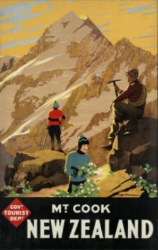
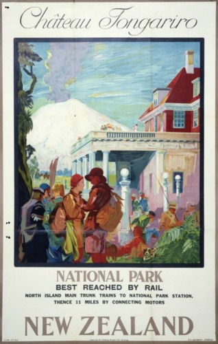
Good quality prints of vintage posters with New Zealand subjects have not been published until relatively recently. Original examples of NZ vintage posters are now very rare (and being highly collectable they are also frightfully expensive!) because most were sent outside of New Zealand - very few posters were designed for domestic consumption. After the vintage "Kiwi" Rolling Stones poster we uncovered last year proved popular and following the success of our test series of prints of three advertising posters originally produced by the publicity department of the New Zealand government owned Railways Department (especially Mt Cook for Winter Thrills) - over the last few months New Zealand Fine Prints have been cataloguing a brand new collection of nearly twenty classic NZ tourism and advertising posters that are now available in New Zealand as high quality digital prints for the first time.
Posters are a challenge to artists and designers as they have to combine imagery with text or typography in a harmonious, imaginative and eye-catching way. We like the posters in New Zealand Fine Prints' vintage poster collection so much because although their styles and subjects may be different to one another somehow a collection of vintage advertising posters on the wall always seem to complement each other in such a pleasing way that the overall impact of the art is enhanced beyond the individual pieces. [And this writer is writing from personal experience because he has lots of these posters on the walls at home himself!].
The new range of New Zealand designed posters that have been added to our large collection of vintage posters launched today includes all the best examples of classic advertising posters created by anonymous artists at New Zealand's tourism and publicity department to promote New Zealand's tourist attractions to overseas visitors that we could find. Shown here are a couple of highlights - "Mt Cook, New Zealand" and "Chateau Tongariro".
Four Square Man Returns in Dick Frizzell's Great New Zealand Songbook Prints
Original artwork by Dick Frizzell was commissioned for the critically acclaimed Great New Zealand Songbook project and we are delighted to have all four of these very special limited edition Dick Frizzell prints in stock this morning.
The Great New Zealand Songbook is a 100 page hardcover journal featuring handwritten lyrics, photos and memorabilia from famous New Zealand musicians like Dave Dobbyn, Bic Runga and Anika Moa.
 These prints (Give it A Whirl, Rock On, Four Four Time (shown here at right) and Side A, Side B) have been nicknamed the "Charlie" series after the supposed real name of the "Four Square Man" character that appears in the artwork especially commissioned from Dick Frizzell by boutique Auckland music company Thom Music for the Great New Zealand Songbook.
Mr Four Square has been a recurring motif in Frizzell's paintings and prints and this time he uniquely re-appears with a guitar slung around his neck.
According to Icon Images, the official licensee of the vintage Mr Four Square logo and image from Four Square store's parent company Foodstuffs (Auckland) Limited Mr Four Square "is the famous smiling logo for the Four Square stores that have conveniently served the local communities and towns around New Zealand for the past 81 years. Locals, visitors, overseas tourists and especially kids all love our very friendly Mr Four Square." They go on to write about the origins of the Four Square name, which emerged nearly 90 years ago when "J. Heaton Barker, the founder of Foodstuffs, called together members of the Auckland Master Grocers Association to discuss the formation of a co-operative buying group of independent grocers. The aim was to counter the activities of grocery chain stores who were making life very difficult for independent grocers. The name Four Square emerged when Mr Barker, while talking on the phone, drew a square around the 4 of the date on his calendar. He immediately realised he had a suitable name for the buying group, stating that "they would stand 'Four Square' to all the winds that blew"."
It was not until the 1950s that anonymous staffers in the Foodstuffs advertising department designed the now famous Four Square man (or Mr Four Square to give him his proper title) - an attribution that is often erroneously given to Dick Frizzell who had simply appropriated the Four Square store's logo in prints such as True Colours and Four Square Man.
Please place your order promptly for these handmade Frizzell limited edition prints as they are sure to sell out very speedily - in particular nearly all of the prints in the edition of Four Four Time were gifted to the musicians who participated in the Great NZ Songbook project so only a very few of these prints are actually available to print collectors outside of this very select group of New Zealanders.
The Great New Zealand Songbook is a 100 page hardcover journal featuring handwritten lyrics, photos and memorabilia from famous New Zealand musicians like Dave Dobbyn, Bic Runga and Anika Moa.
Mr Four Square has been a recurring motif in Frizzell's paintings and prints and this time he uniquely re-appears with a guitar slung around his neck.
According to Icon Images, the official licensee of the vintage Mr Four Square logo and image from Four Square store's parent company Foodstuffs (Auckland) Limited Mr Four Square "is the famous smiling logo for the Four Square stores that have conveniently served the local communities and towns around New Zealand for the past 81 years. Locals, visitors, overseas tourists and especially kids all love our very friendly Mr Four Square." They go on to write about the origins of the Four Square name, which emerged nearly 90 years ago when "J. Heaton Barker, the founder of Foodstuffs, called together members of the Auckland Master Grocers Association to discuss the formation of a co-operative buying group of independent grocers. The aim was to counter the activities of grocery chain stores who were making life very difficult for independent grocers. The name Four Square emerged when Mr Barker, while talking on the phone, drew a square around the 4 of the date on his calendar. He immediately realised he had a suitable name for the buying group, stating that "they would stand 'Four Square' to all the winds that blew"."
It was not until the 1950s that anonymous staffers in the Foodstuffs advertising department designed the now famous Four Square man (or Mr Four Square to give him his proper title) - an attribution that is often erroneously given to Dick Frizzell who had simply appropriated the Four Square store's logo in prints such as True Colours and Four Square Man.
Please place your order promptly for these handmade Frizzell limited edition prints as they are sure to sell out very speedily - in particular nearly all of the prints in the edition of Four Four Time were gifted to the musicians who participated in the Great NZ Songbook project so only a very few of these prints are actually available to print collectors outside of this very select group of New Zealanders.
Weston Frizzell Auckland Supercity logo
 New Zealand's favourite contemporary pop art duo Mike Weston (pictured below, left) and Otis Frizzell (pictured below, right) are ramping up their campaign to subvert the Auckland Supercity Logo design competition today with their Weston Frizzell style Supercity logo being rolled out via a poster campaign throughout inner city Auckland in defiance of the "official" competition.
 Otis says about the Auckland Supercity Logo Competition that they "can't enter because my Dad [Dick Frizzell] is a judge, so Mike Weston and I plan to start our own campaign using our logo." According to Mike the Weston Frizzell logo for the new Auckland council (pictured here) is "Pacific , Asian, Maori, Christian, pretty, sexy, masculine, feminine and green."
Mike warned Aucklanders to "watch the walls near you" when news of Weston Frizzell's subversion of the Auckland Super City logo competition process broke earlier this month and Otis confirmed over the weekend that "We've got 500 posters and we're gonna paste 'em up round the inner city…let's see if we can own something simply by doing it. We don't need a council to tell us what's good!"
 Will the Weston Frizzell Supercity logo "wind its way into the consciousness of the city" as judge Hamish Keith told TVNZ back in February? We think it should and we are urging all our New Zealand Art Print News readers to add their support for the Weston Frizzell Supercity Logo by joining their campaign on Facebook.
Michael Smither talks about Taranaki painting "Rocks with Mountain"
New Zealand Geographic magazine recently published an issue (number 67) focusing on the Taranaki region - and one of the most famous images of Mount Taranaki is the one with the stones and a rock pool in the foreground and a small red tractor on the horizon. This is a painting called Rocks with Mountain by Michael Smither.
I was surprised to read the rather sombre symbolism the artist saw in this painting, Smither is quoted in New Zealand Geographic "I was painting this at the time of the Czech revolution. Looking up, I saw the red tractor, the mountain, and the pool in the foreground with pink coralline on the rocks - and it struck me as being like the blood of martyrs, squeezed out and trickling down into these waters".
I'm not sure that this reading of such a well-known painting has ever been written about before - it certainly isn't an obvious interpretation of what appears today as straightforward representational painting (albeit with a radical viewpoint and interesting composition). Artist Photo Credit: Tom Turner/Art New Zealand
Subscribe to:
Posts (Atom)


