Shane Hansen - new works at Prints.co.nz

Artist Shane Hansen in his studio
Shane Hansen
Auckland printmaker Shane Hansen has recently completed some new editions which is exciting news for collectors of contemporary NZ original prints.  Artwork from the high profile Maori artist  has been purchased in prestigious private commissions such as Air New Zealand's Koru Lounge at Auckland International Airport and a recent painting was included in the landmark Ngaa Pou Whenua show at Waikato Museum in 2011.  Hansen's new work is building on a solid back catalogue of sold out print editions including his Friendy tiki series (Pania, Boy and Friendy et al on vintage wallpaper) and screenprints on plywood Te Kereru, Kokako & Aroha, Te Kea Aoraki etc.

Shane Hansen - who is of Tainui - Ngati Hine, Ngati Mahunga descent -  says about his new prints "The detail of my mahi [translation from Maori = work, to make], is in its simplicity. Keeping details to a minimum to acheive an image of high impact, depth and meaning is a challenge but I feel the work is stronger because of it. The term less is more is definitely the case with my work and it doesn't mean it is less meaningful."

Print by Shane Hansen "Waitakere Wairua"
Waitakere Wairua | 1100 x 550mm | Edition of 35 prints 
Waitakere Wairua [translation from Maori = Spirit, Soul)
Based on an artwork for the ‘Living & Learning Centre’ in Henderson, West Auckland. This print represents the cultures, lifestyle and spirit of the Auckland area and also the people that inhabit it. In this print Shane tells us that "The Kokako is a kaitiaki (Maori = "guardian"), watching over the Waitakeres, helping forge a brighter future for the tamariki (Maori = Children). Looking down from the Waitakere ranges towards Rangitoto, the Kokako feels proud and privileged to be part of it all." Archival giclee print in an edition of 35 signed and numbered by Hansen.
Ataahua Tieke print by Shane Hansen (Gold colourway)
Ataahua Tieke (Gold) | 560 x 750mm | Edition of 35 Prints
Ataahua Tieke (Gold) 
Hansen says that this print was inspired by an encounter he had with the unique NZ saddleback (tieke),"The handsome saddleback greeted me with surprise in his eyes", he told NZ Art Print News, "The bird seemed to be saying 'Who is this who seeks my attention? You have come, so I will go.'" Tieke belong to the Wattlebird family which includes the kokako and the (extinct) huia. In Maori the word Ataahua means beautiful. Ataahua Tieke is available in two colourways, green and gold (the Gold edition is shown here) in editions of 35 prints.

See all prints by Shane Hansen in the Shane Hansen collection at New Zealand Fine Prints, his work also features in the Maori art collection at New Zealand's specialist art print store.

Blockbusters Exhibition: Promotional screenprint signed by Dick & Otis Frizzell + Mike Weston

Frizzell Blockbusters Exhibition Poster
A promotional screenprint has been released for the "Blockbusters" exhibition of new work from Frizzell and Son (Dick and Otis Frizzell) and Weston Frizzell (Otis Frizzell and Mike Weston in collaboration).

In the vocabulary of graffiti art the term Blockbuster refers to a piece where one word occupies the entire wall. The outlined text is predominantly defined by the blacking out of the gaps and negative space. Parasitic of the underlying work, a BLOCKBUSTER envelopes and consumes the surface.

A Blockbuster is also the biggest thing of the summer, the thing everyone has to see.

The Blockbusters screen print is large (A1 size) numbered and signed by Dick Frizzell, Otis Frizzell and Mike Weston.

Just $100 each, edition of 100 - available here (for a very limited time!).

Retro or Vintage? How do we classify prints?

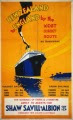
Vintage Shipping Poster
One of my jobs as the catalogue manager at New Zealand Fine Prints is sorting the latest prints into categories - because we want our customers to quickly and easily find the prints they want to buy when they visit NZ's largest art print shop. We don't expect our customers to always have in mind the exact artwork they are looking for when they start shopping at NZ Fine Prints. If a buyer has a specific print that they are searching for (or are only looking for prints available by a particular NZ artist) - then it's straightforward to search by keyword or alphabetical listing by artist surname. Although we do have a master gallery of all prints in stock at NZ Fine Prints listed in alphabetical order by title we spend a lot of time thinking about how to thematically link prints so that buyers can easily slip into a rich vein of art that is exactly the sort of thing they are looking to buy without having to trawl through every one of the thousands of prints in stock.

Unlike books which come already classified by the publisher and easily organised using the Dewey decimal system prints can be organised easily by artist/photographer/printmaker and by type (such as lithographs or prints on canvas) and by period but much less easily by topic than you might think at first glance. This has been shown recently when trying to decide how to categorise a series of pictures from New Zealand painters and designers that are clearly not contemporary in a fashion forward interior design sense but are a contemporary artwork that Retro Ski Poster by Paul Nyis referencing or remixing kiwi culture and especially kiwiana icons. I didn't feel comfortable selling these modern designs such as "Ski NZ" by Image Vault's Paul Ny pictured here alongside the real deal (eg prints of actual work by early NZ graphic designers such as Leonard Mitchell and Marcus King) in case buyers thought we passing them off as genuine historical designs. So we have decided to re-organise the images into two galleries, retro and vintage.

What is the difference between the retro and the vintage collections at NZ Fine Prints? We have decided that vintage means old, classic and authentic. Retro has two meanings in art and design. It is often used as a shorthand to describe a design period more recent than vintage, for instance mid twentieth century furniture such as your grandparents formica table is retro. However we have decided that the second usage of the word to describe contemporary design that is looking self-consicously back to an earlier period (as in the "neo-deco" retro style of designers Terry Moyle and Rosie Louise from NZ's Contour Creative Studio) is a more useful way of categorising the modern prints. Our retro collection is therefore the home of modern designers and artists working in a retro style such as Contour Creative Studio, Paul Ny and kiwiana art specialist Jason Kelly. Whose style could probably also be called "old school", now that makes me wonder if compiling an "old school" collection is a helpful idea as well…

Hundertwasser's Alternative NZ Flag Manifesto

Flags are a potent national symbol for artists to reference, recycle and re-imagine. Consider Jasper Johns "3 Flags", Jimi Hendrix's "Star Spangled Banner", or closer to home Otis Frizzell and Mike Weston's controversial re-imagining of the NZ Flag as redesigned by a blast from Tame Iti's shotgun. The official NZ ensign has featured in prints such as the relatively straightforward Timo Rannali Aotearoa/NZ Flag print with the words of our national anthem (God Defend New Zealand) in English and Maori superimposed and a more unusual juxtaposition of the flag with a John Dory fish by Auckland printmaker Brad Novak. There are ongoing campaigns to re-design the New Zealand flag to eliminate the Union Jack, most recently a competition was promoted by the late Lloyd Morrison but none has attracted as much long term support as the alternative NZ Koru flag designed by Friedensreich Hundertwasser.

Hundertwasser (1928 - 2000) was one of Austria's most famous 20th century artists also known for his building designs which eschewed straight lines in favour of more organic forms. Hundertwasser visited New Zealand from 1973 and eventually lived here until his death in 2000. His Koru flag is the only non-print that we stock here at New Zealand Fine Prints, because of its importance in our design history we decided we had to have it for sale and it has sold steadily for over ten years now in two sizes, medium and large.

Recently we re-discovered the original long manifesto by Hundertwasser "A Flag of our Own" bundled up with a box of flags. Here it is:

Proposal for a second flag for New Zealand, which represents an unmistakeable identity that combines New Zealand’s age old heritage of nature and the heritage of Maori history with the growing future of a new nation.

The flag symbolizes old and new, history and progress at the same time. This flag symbolizes peace, but not weakness, but the strength of creation moving forward in a courageous engagement.

At a moment in human history with increasing environmental concern New Zealand gives an example to the world because this flag represents peace with nature, human development in harmony with nature. It is the sign of understanding with this everlasting powerful ally. This flag is a symbol of a new age, a big step towards mankind’s responsible evolution.

The fern’s green spiral on white or silver ground starts at the black flagstaff lead taking up the whole width of the flag first decreasing gradually, dividing the flag into diagonal halves, then curling up in to a spiral at the other end of the flag.

The spiral unfurling in a rectangular flag is the image of union of nature and technology, of round and square.

It seems as if the flag contains another flag advancing, streaming, unrolling and opening up in a strange and mysterious wind, a flag which is transformed into another dimension.

It is an image of how matter concentrates and turns into life. Quantity is transformed into energy. It is a symbol of the never ending cycle, a symbol for ever renewing life.

The green is carefully composed of the special earthy deep, lush and fertile greens of the New Zealand bush and farmlands, not occurring anywhere else. This green is the wealth of New Zealand.

The Maori spiral and the sprouting fern symbol combined, the koru, already represent New Zealand in many fields like for instance the Air New Zealand sign.

This flag is unique and cannot be mistaken for any other flag, as is the case with the present flags of New Zealand and Australia, and the flags of many other nations. A recent example of how a symbol was accepted to represent a country with an identity quest similar to that of New Zealand is the maple leaf in the flag of Canada. In Australia too, efforts are undertaken to find a new flag. Let New Zealand be first.

May New Zealand be part of the nations with a beautiful and meaningful and unique flag.

It is an intelligent flag full of joy, it is indigenous, it contains a message, it has a purpose, it is different. It holds the mystery of this remote land. It is a flag to love because it is special, a flag to identify with.

Like a fern sprouting, like a wave of nature, like a flag unfolding.

It is a proud symbol of this nation, representing Maori history, representing the green land and the long white cloud, a true messenger of New Zealand to the world, independent, strong, invincible, full of life and energy, unmistakably New Zealand, a flag of future and age old identity.

This second flag for New Zealand is in no way designed to detract from the Union Jack, the Southern Cross, the British monarchy, the Commonwealth, the British heritage and New Zealand traditions. The fern flag will fly happily together with the official Blue Ensign. It signals that New Zealand has come of age and qualifies as an equal among the nations of this Earth. The koru ensign symbolizes the love of New Zealanders for their country.
Bay of Islands, the 18th of March 1983.

The proposal for a second flag for New Zealand is a beautiful insight into the designer's thinking and the powerful symbolism of the design. Especially interesting to read that Hundertwasser was not actually proposing to replace the official Blue Ensign with the Koru flag.

Weston Frizzell ask "Who are the real terrorists?"

When news of the arrest of Tuhoe activist Tame Iti under NZ's anti-terrorism laws reached Auckland pop art studio Weston Frizzell they were "really shocked, as were most people who knew Tame". There has been a long and artistically productive collaboration between the veteran Maori activist and the two artists who collaborate as Weston Frizzell, Mike Weston and Otis Frizzell.

With a series of four prints Weston and Frizzell are asking "Who are the real terrorists?". Weston says "The government were looking for a chance to flex their new draconian laws that had been created in response to US foreign policy bullying and Tame copped the full force of it."

Yeah Right by Otis Frizzell & Mike Weston

“Yeah Right” is a satirical adaptation of the popular Tui Beer advertising campaign that uses sarcasm in a humorous social commentary. In this artwork Mike Weston and Otis Frizzell present their version of Tui’s iconic ad, substituting an AK47 assault rifle for the usual perch branch. In Yeah Right, Tutu replaces both the Tui Beer branding, and also the social statement that is usually featured in the Tui beer billboard.

Dr Tutu is the name Tame Iti adopted when DJing on his various alternative radio slots. It features in the title of works Tututables, and Tututime 2004, and the logo featured on the painted canvas works exhibited. In Maori, (and most if not all Polynesian languages also) Tutu has a multiplicity of meanings such as ‘revolution’, ‘to meddle’, ‘arson’ and ‘sedition’. Tutu and the glyphic logo formed by the inverted numerals 22 (see below) have been recurring motifs in Weston Frizzell’s work since 2004. The message it conveys relates directly to the arrest of Tame Iti and other Tuhoe members under the terrorism suppression act. If it were spelled out it might read: “A terrorist revolution? Yeah, right.” Yeah Right is a fine art archival inkjet print on Hahnemule 100% cotton rag paper, edition of 180.


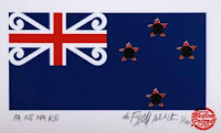
Pakehake by Mike Weston & Otis Frizzell

“I fully support the redesign of the flag,” Otis Frizzell told Wellington's Capital Times after Iti desecrated the NZ flag with a shotgun blast before the Waitangi Tribunal in 2005. “Whether it was right or wrong [Iti] was redesigning it in his own special way. The bullet holes in this work represent what Tame did to the flag." Edition of 180 prints, handprinted then signed and numbered.

The term Pakehake contains two possible meanings. In Maori the addition of the suffix ke transforms Pakeha into an expletive, a curse , an insult. Additionally Pake means flag and Hake means torn, thus the title ‘Torn Flag’. Pa Ke Ha Ke is Weston Frizzell's new version of the New Zealand ensign complete with bullet holes.

Dr Tutu Feat. Tame Iti Print by Weston Frizzell

The print "Dr Tutu featuring Tame Iti" is a combined image of four paintings from the 2004 exhibition at Mike Weston's "The Area" gallery. From left to right Whenua, Aotearoa Not for Sale, Horimoni and Tututime. Weston and Frizzell conceived an imaginary contemporary scenario where no colonisation had occurred and devised a number of graphic motifs and symbols such as you might find on road markings or signs or perhaps corporate branding responding to this notion.

Mike takes up the story "I was approached by an American couple who wanted to record a spoken word project with Tame. I made four pieces for an art / CD package. I figured it wasn’t going to be a big seller but had some potential to go the distance if it was leaned more in an art direction so I started jamming ideas for a special package CD which ultimately ended up being an art exhibition concept, with a CD attached to each artwork." Mike continues "I had an idea of illustrating Tame’s face in the style of the 4 square man, in a nod to Dick Frizzell's Grocer with Moko, so I called my good mate Otis Frizzell, who I’d been managing on and off for a few years, to do the illustration of that and he nailed it so well that I asked Otis to collaborate on the art side of it 50:50 with me. We found ourselves enthusiastically throwing paint around all over the place, jamming a lot of ideas, running them past Tame to make sure he was alright with it, and mostly he was and we made four series of canvasses each in editions of 22, presenting visual representations of each of the musical works [also available for download at Amplifier] on the CD."

The first time Otis had met the Tuhoe Maori activist was back in the 1990s. Frizzell had become friends with a group of hip hop artists, including DLT and Che-Fu during the time Frizzell was performing as half of hip hop duo MC OJ and the Rhythm Slave. DLT and Che-Fu would take international artists to a Marae on Tuhoe land, in the eastern North Island for what Otis describes as “a taste of true Maoriness - we’d give them a dose of old school Maori – it is pretty awesome to be a European and be invited in there.”

The translation of the Dr Tutu persona into visual forms such as the inverted "22" came about as Weston was using the "I Ching regularly as a kind of metaphysical guide and mirror during this time". Weston repeatedly found himself at "the 22nd hexagram passage, Pi (or Grace). The sentiment expressed in the Wilhelm translation “things should not unite abruptly or ruthlessly” seemed to fit the bicultural nature of the musical collaboration very well, and the coincident 22, resonated with the Dr Tutu name of the project. Of course there’s the additional Catch 22 reference. It stuck." Weston also says, "I noticed that the number 22 revolved 180 degrees created a glyphic logo that evoked a double Manaia, a Maori influenced Hindu Arabic form that in an abstract sense embodied many of the ideas of bicultural collaboration we were working with."

Frizzell and Weston started putting that symbol on artworks that spoke of those issues - beginning with the 88 canvasses in the Dr Tutu show. The inverted 22 also appears on prints outside of the series of works discussed in this article, such as Behave and Four Seasons Winter. Says Weston "I figured it would stick in peoples' minds because they would be wondering why it was upside down".

Urewera Print by Mike Weston & Otis Frizzell

The full line up of the "We are" letter paintings were prepared to show at Auckland's "Original Art Show" in 2010 when Weston Frizzell were the featured artist guests. In "Give it Back" the letters are arranged to spell the word "Urewera". This print is available in a tiny edition of just, you guessed it, 22 - the message regarding Tuhoe's land in the Urewera is to "Give it Back".

It is significant that Otis Frizzell's collaboration on the Dr Tutu project with Mike Weston established the new working relationship that evolved into the now high profile Weston Frizzell pop art brand.

Art doesn't happen in a socio-political vacuum, our visual culture is shaped by and responds to current events. We hope the art buying public will show their support for artists such as Weston and Frizzell who are responding thoughtfully and creatively to current events in Aotearoa/New Zealand by purchasing prints from the Weston Frizzell series of contemporary editions.