Showing posts with label Mike Weston. Show all posts

KUPU - Word prints by Weston Frizzell

Kupu Print by Weston Frizzell
"Kupu" Maori noun. Definition/translation into English "Word".

In 2009 Weston Frizzell began exploring and remixing the iconography of NZ fine art and popular culture into the letter series, a suite of prints that rearranged letters appropriated from iconic NZ artworks by artists such as Colin McCahon and brands, for example Watties and L&P.  The first word prints produced were those perceived by the artists as the most prominent in the kiwiana genre of decorative art, Aotearoa, Aroha and Home.

For the second series of word prints the initial intention was to create artworks montaging images of the letter paintings to form a series of words specific to the location of each destination of a touring show.  Taupo was the first of this series (in an edition of 10 that has now sold out).  The release of today's suite is arranged around a choice of letters specifically restricted to those of the written Maori language again with visual subject matter limited to NZ only. The prints are "Kupu", "Mate", "Pakeha", "Kapow" and "AEIOU".

Working backwards from the answer, Weston Frizzell conceived print designs that combine letters from a painted series. The individual letters are realised as 800 x 1200mm painted artworks, then images of the completed paintings were digitally captured, and the files assembled to create the final digital master files. Weston Frizzell regard the final work as not derivative of the painting process. The inverse is true. The paintings are regarded as artifacts of the creation of a digital print!
Otis Frizzell and Mike Weston signing the new prints
at their Auckland studio
Who is Weston Frizzell? We have written before about differentiating your Frizzells, but in essence Weston Frizzell is the collaborative identity of artists Otis Frizzell and Mike Weston. An experiment in the subversion of brand management theory that has evolved into a successful and frequently controversial art identity (see for example the controversy over their Auckland Supercity logo or Weston Frizzell ask "Who are the real terrorists?"), Weston Frizzell occupy a cleverly conceived niche that is now well established on the NZ fine art stage.  

All of the Kupu work can be seen at the touring exhibtion of Weston Frizzell prints and paintings produced by Th'ink and The Area, check the show out in Wellington at Thistle Hall, 293 Cuba St 29 July - 4 August 2013 and at the International Visual Methods Conference at Victoria University 2 September to 6 September.  Kupu moves to Auckland at Augusto, 90 Wellesley St 20 August to 25 August and then onto Melbourne at Second Story, 159 Sackville St, Collingwood 23 September to October 6th.

Weston Frizzell ask "Who are the real terrorists?"

When news of the arrest of Tuhoe activist Tame Iti under NZ's anti-terrorism laws reached Auckland pop art studio Weston Frizzell they were "really shocked, as were most people who knew Tame". There has been a long and artistically productive collaboration between the veteran Maori activist and the two artists who collaborate as Weston Frizzell, Mike Weston and Otis Frizzell.

With a series of four prints Weston and Frizzell are asking "Who are the real terrorists?". Weston says "The government were looking for a chance to flex their new draconian laws that had been created in response to US foreign policy bullying and Tame copped the full force of it."

Yeah Right by Otis Frizzell & Mike Weston

“Yeah Right” is a satirical adaptation of the popular Tui Beer advertising campaign that uses sarcasm in a humorous social commentary. In this artwork Mike Weston and Otis Frizzell present their version of Tui’s iconic ad, substituting an AK47 assault rifle for the usual perch branch. In Yeah Right, Tutu replaces both the Tui Beer branding, and also the social statement that is usually featured in the Tui beer billboard.

Dr Tutu is the name Tame Iti adopted when DJing on his various alternative radio slots. It features in the title of works Tututables, and Tututime 2004, and the logo featured on the painted canvas works exhibited. In Maori, (and most if not all Polynesian languages also) Tutu has a multiplicity of meanings such as ‘revolution’, ‘to meddle’, ‘arson’ and ‘sedition’. Tutu and the glyphic logo formed by the inverted numerals 22 (see below) have been recurring motifs in Weston Frizzell’s work since 2004. The message it conveys relates directly to the arrest of Tame Iti and other Tuhoe members under the terrorism suppression act. If it were spelled out it might read: “A terrorist revolution? Yeah, right.” Yeah Right is a fine art archival inkjet print on Hahnemule 100% cotton rag paper, edition of 180.


Pakehake by Mike Weston & Otis Frizzell

“I fully support the redesign of the flag,” Otis Frizzell told Wellington's Capital Times after Iti desecrated the NZ flag with a shotgun blast before the Waitangi Tribunal in 2005. “Whether it was right or wrong [Iti] was redesigning it in his own special way. The bullet holes in this work represent what Tame did to the flag." Edition of 180 prints, handprinted then signed and numbered.

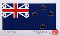
The term Pakehake contains two possible meanings. In Maori the addition of the suffix ke transforms Pakeha into an expletive, a curse , an insult. Additionally Pake means flag and Hake means torn, thus the title ‘Torn Flag’. Pa Ke Ha Ke is Weston Frizzell's new version of the New Zealand ensign complete with bullet holes.

Dr Tutu Feat. Tame Iti Print by Weston Frizzell

The print "Dr Tutu featuring Tame Iti" is a combined image of four paintings from the 2004 exhibition at Mike Weston's "The Area" gallery. From left to right Whenua, Aotearoa Not for Sale, Horimoni and Tututime. Weston and Frizzell conceived an imaginary contemporary scenario where no colonisation had occurred and devised a number of graphic motifs and symbols such as you might find on road markings or signs or perhaps corporate branding responding to this notion.

Mike takes up the story "I was approached by an American couple who wanted to record a spoken word project with Tame. I made four pieces for an art / CD package. I figured it wasn’t going to be a big seller but had some potential to go the distance if it was leaned more in an art direction so I started jamming ideas for a special package CD which ultimately ended up being an art exhibition concept, with a CD attached to each artwork." Mike continues "I had an idea of illustrating Tame’s face in the style of the 4 square man, in a nod to Dick Frizzell's Grocer with Moko, so I called my good mate Otis Frizzell, who I’d been managing on and off for a few years, to do the illustration of that and he nailed it so well that I asked Otis to collaborate on the art side of it 50:50 with me. We found ourselves enthusiastically throwing paint around all over the place, jamming a lot of ideas, running them past Tame to make sure he was alright with it, and mostly he was and we made four series of canvasses each in editions of 22, presenting visual representations of each of the musical works [also available for download at Amplifier] on the CD."

The first time Otis had met the Tuhoe Maori activist was back in the 1990s. Frizzell had become friends with a group of hip hop artists, including DLT and Che-Fu during the time Frizzell was performing as half of hip hop duo MC OJ and the Rhythm Slave. DLT and Che-Fu would take international artists to a Marae on Tuhoe land, in the eastern North Island for what Otis describes as “a taste of true Maoriness - we’d give them a dose of old school Maori – it is pretty awesome to be a European and be invited in there.”

The translation of the Dr Tutu persona into visual forms such as the inverted "22" came about as Weston was using the "I Ching regularly as a kind of metaphysical guide and mirror during this time". Weston repeatedly found himself at "the 22nd hexagram passage, Pi (or Grace). The sentiment expressed in the Wilhelm translation “things should not unite abruptly or ruthlessly” seemed to fit the bicultural nature of the musical collaboration very well, and the coincident 22, resonated with the Dr Tutu name of the project. Of course there’s the additional Catch 22 reference. It stuck." Weston also says, "I noticed that the number 22 revolved 180 degrees created a glyphic logo that evoked a double Manaia, a Maori influenced Hindu Arabic form that in an abstract sense embodied many of the ideas of bicultural collaboration we were working with."

Frizzell and Weston started putting that symbol on artworks that spoke of those issues - beginning with the 88 canvasses in the Dr Tutu show. The inverted 22 also appears on prints outside of the series of works discussed in this article, such as Behave and Four Seasons Winter. Says Weston "I figured it would stick in peoples' minds because they would be wondering why it was upside down".

Urewera Print by Mike Weston & Otis Frizzell

The full line up of the "We are" letter paintings were prepared to show at Auckland's "Original Art Show" in 2010 when Weston Frizzell were the featured artist guests. In "Give it Back" the letters are arranged to spell the word "Urewera". This print is available in a tiny edition of just, you guessed it, 22 - the message regarding Tuhoe's land in the Urewera is to "Give it Back".

It is significant that Otis Frizzell's collaboration on the Dr Tutu project with Mike Weston established the new working relationship that evolved into the now high profile Weston Frizzell pop art brand.

Art doesn't happen in a socio-political vacuum, our visual culture is shaped by and responds to current events. We hope the art buying public will show their support for artists such as Weston and Frizzell who are responding thoughtfully and creatively to current events in Aotearoa/New Zealand by purchasing prints from the Weston Frizzell series of contemporary editions.

Notable new releases at NZ Prints

New releases have been piling up at New Zealand Fine Prints while behind the scenes we have been occupied with sorting and re-shelving the thousands of prints shifted from our Hereford St gallery following the Christchurch earthquakes.

Home by Weston Frizzell  1000 x 515mm [Edition of 80 Prints]

Among the new prints that have arrived have been a couple of superb new letter series prints called "Home" and "Whanau" from the studio of Mike Weston and Otis Frizzell  (for disambiguation of the various Frizzell monikers check out our previous article on who is Weston Frizzell?) and the complete Weston Frizzell seasons series (Spring, Summer, Autumn and Winter) are now in stock with some matching numbered sets still available. 

Mike has also just sent us some previously unseen editions from the Auckland Supercity styles series, the last two editions of the Behave series and his latest solo work "Float" that we'll get catalogued onto prints.co.nz mid August - with a backlog of over 140 prints waiting to be photographed and described we are running several weeks behind schedule for new artwork submissions.  Artists submitting new prints with the images ready, dimensions measured and a great description of the artwork written with the customer in mind may find they are bumped to the top of the queue!

Weston Frizzell Auckland Supercity logo

New Zealand's favourite contemporary pop art duo Mike Weston (pictured below, left) and Otis Frizzell (pictured below, right) are ramping up their campaign to subvert the Auckland Supercity Logo design competition today with their Weston Frizzell style Supercity logo being rolled out via a poster campaign throughout inner city Auckland in defiance of the "official" competition. 

Otis says about the Auckland Supercity Logo Competition that they "can't enter because my Dad [Dick Frizzell] is a judge, so Mike Weston and I plan to start our own campaign using our logo."  According to Mike the Weston Frizzell logo for the new Auckland council (pictured here) is "Pacific , Asian, Maori, Christian, pretty, sexy, masculine, feminine and green."

Mike warned Aucklanders to "watch the walls near you" when news of Weston Frizzell's subversion of the Auckland Super City logo competition process broke earlier this month and Otis confirmed over the weekend that "We've got 500 posters and we're gonna paste 'em up round the inner city…let's see if we can own something simply by doing it. We don't need a council to tell us what's good!" 

Will the Weston Frizzell Supercity logo "wind its way into the consciousness of the city" as judge Hamish Keith told TVNZ back in February? We think it should and we are urging all our New Zealand Art Print News readers to add their support for the Weston Frizzell Supercity Logo by joining their campaign on Facebook.

Weston Frizzell - New Prints by Mike Weston and Otis Frizzell

Weston FrizzellWeston Frizzell is the collaborative identity of artists Otis Frizzell and Mike Weston. 


Art and branding collide again with Weston Frizzell's new series of prints. According to Mike and Otis their new prints represent "the next level of the Weston Frizzell strategic evolution applying a combination of approaches, styles, and ideas to explore the iconography of NZ fine art art and popular culture." Subversive commercialism and the outright audacity of their appropriated subject matter in their latest prints shows the fearlessness that the Weston Frizzell brand has come to signify.

In nine years of working together Otis Frizzell and Mike Weston’s creative partnership has evolved from celebrity artist and his art dealer into a full blown art collaboration.

Described by Artnews as "a high performance art partnership", their Warhol influenced production line methods and an entertainment industry honed promotion and management strategy has taken Weston Frizzell from the street art and pop culture melting pot of Auckland's K Rd into the fine art world. Their output draws heavily on appropriated imagery, style and content presented with satiric and often ironic subtext - Weston Frizzell prints challenge notions of authorship and originality.

Both artists have their roots deep in New Zealand's counterculture . The range of skills and influences they share is diverse and eclectic. The Weston Frizzell partnership equally acknowledges contribution of ideas, craft, celebrity, management, and labour in the production and marketing of shared output of works and in the division of the proceeds.

According to Mike Weston and Otis Frizzell their combined skills and the diversity of influences express an aesthetic that is positioned at the "very high end of the low brow".

We were delighted to receive three new prints, Aotearoa, Aroha and World of Love from Weston Frizzell's latest series this morning.